

Last week we wrote about an FT article that looked at the Fed’s Flow of Funds numbers. The article had concluded that REIT repo was bigger than broker/dealer repo activity, an observation that didn’t make sense to us. We pointed out that the Fed’s numbers showed a net repo position (repos less reverses) and that was not a useful way to look at the market. Well, the Fed just released their 2014:Q1 Flow of Funds numbers. In the process, they changed the way they present the figures and it makes a lot more sense.
The new data breaks out the flows by assets (reverses repos) and liabilities (repos). It also includes Fed Funds bought and sold too. Apparently some of the numbers that are reported to the Fed don’t break the two apart. Our suggestion for a next iteration would be to separate the two given that one is secured, the other unsecured. But given that the Fed Funds market is pretty small these days, there aren’t many players involved, and there is some research available that could help us parse those numbers apart, it isn’t that big of a deal to make a simple adjustment.
Lets look at the size of the broker/dealers books. The net number we last saw for “Security brokers and dealers; security repurchase agreements” was $135.3 billion for year-end 2013. In the new report, (L.207 Federal Funds and Security Repurchase Agreement) the 2013:Q4 net number is now $447.6 billion – so it looks like there were some big adjustments made. In the new report the Fed shows for 2014:Q1 $1,692.8 billion in repos and $1,267.5 billion in reverses, a net of $425.3 billion. Again, the difference between repos and reverses (presumably) being the house positions that each dealer has to finance. Otherwise, repo is pretty much a closed ecosystem.
The graph below shows the historical liabilities (repos) and assets (reverses) side by side. It is interesting to see the steady climb in the market from 2009 to 2012, followed by a pull back in 2013 and into 2014.
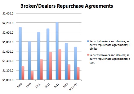
(Billons)
Source: http://www.federalreserve.gov/releases/z1/current/accessible/
l207.htm#footnote_20024
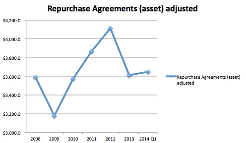
This graph illustrates the net position, showing the size of the house positions financed. It should come as no surprise that these positions have been on a downward slide.

(Billions)
Source: http://www.federalreserve.gov/releases/z1/current/accessible/
l207.htm#footnote_20024
What about the repo market as a whole? Numbers for the repo market in the U.S. are a hodgepodge of statistics, never giving a complete picture. The new Federal Reserve Flow of Funds numbers will provide something we hope is more complete.
As we mentioned earlier, the Flow of Funds numbers include Fed Funds bought and sold. But that market has shrunk considerably. The fall off in the Fed Funds market began when the Fed started paying IOER in October, 2008. In mid-2007, Fed Funds lent was $221.8 billion, but by the end of 2008, it had fallen to $72 billion. At the end of the 4th quarter of 2012, Fed Funds sold was $60.3 billion, $44 billion of which was to the Federal Home Loan Banks. We can adjust out Fed Funds sold using the Fed’s own data. Unfortunately, it doesn’t go past the end of 2012. We assumed the Fed Funds market was stable past 2012. This is the result:
(Billions)
Source: http://www.federalreserve.gov/releases/z1/current/accessible/
l207.htm#footnote_20024, Finadium
The Fed uses the following categories in the Flow of Funds data:
- Nonfinancial corporate business; security repurchase agreements
- State and local governments, excluding employee retirement funds; federal funds and security repurchase agreements
- Rest of the world; security repurchase agreements
- Monetary authority; security repurchase agreements
- U.S.-chartered depository institutions, including IBFs; federal funds and security repurchase agreements
- Foreign banking offices in the U.S. including IBFs; federal funds and security repurchase agreements
- Property-casualty insurance companies; security repurchase agreements
- Life insurance companies, general accounts; security repurchase agreements
- Privatate pension funds; federal funds and security repurchase agreements
- State and local government employee retirement funds; federal funds and security repurchase agreements
- Money market mutual funds; federal funds and security repurchase agreements
- Mutual funds; security repurchase agreements
- Government-sponsored entities; federal funds and security repurchase agreements
- Security brokers and dealers; security repurchase agreements
- Holding companies; security repurchase agreements
- Funding corporations; federal funds and security repurchase agreements
- Instrument discrepancies; federal funds and security repurchase agreements
There is more analysis to be done using the figures. We think the new data is an positive step forward.