The Office of Financial Research (OFR) has just published their Financial Stability Monitor. It has a great graphical way, using heat maps, to see how markets drivers have changed over time. Their stats start in 2004:Q1 and go to 2015:Q1. We play with the graphs a bit.
OFR lists 5 categories: Macro, Market, Credit, Funding/Liquidity and Contagion. Within those buckets are specific indicators the OFR looks at as well as a breakdown of the components behind those indicators. For example, for Funding/Liquidity (our personal favorite), the hierarchy looks like this:
Funding/Liquidity
- Funding Conditions
- TED Spread
- Dollar Funding
- Market Leverage
- Excess Liquidity
- Market Liquidity
- Treasury On/Off the Run
- Trading Volume
- Fails to Deliver
- Nomura Dollar Liquidity Index
- Citi Market Liquidity Index
- Corporate Bond Turnover
- Balance Sheet Liquidity
- Corporate Cash
- Bank Liquid Assets
- Intermediation
- Money Fund AUM
- Money Fund WAM
- Dealer Inventories
This is a very impressive array of factors. The OFR has a biannual review of the data too. According to the review, the intention is that the data provides an “early warning signal of stress at a reasonable horizon”.
OFR will test the inputs.
“…The indicators that performed well on these tests are weighted more heavily. Weaker performers are discarded or weighted less heavily…”
This may seem like a crystal ball, but:
“…The monitor is not intended to predict the timing or severity of financial crises, but rather to identify underlying vulnerabilities that may predispose a system to instability…”
What did they say about Funding/Liquidity in their most recent report?
“…Funding conditions remain broadly stable, but market liquidity appears fragile and a potential amplifier of stress. Lets look at how Funding/Liquidity behaved…. “
“…Meanwhile, some market liquidity measures — the ability of market participants to sell assets with limited price impact and low transaction costs — signal a deterioration in liquidity. These changes have occurred along with a decline in the provision of liquidity by primary dealers, which could potentially reduce their willingness to buffer intense selling pressure. This is partly reflected in the monitor’s “intermediation” subcategory…”
“…Overall, market liquidity appears more fragile in recent years. Although leverage in the financial system remains contained, which reduces the potential for a leverage-induced asset fire sale, amplifiers of stress related to liquidity remain a concern…”
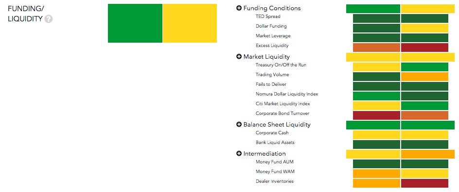
As an example, we compared Funding/Liquidity Q1: 2014 to Q1: 2015. The scale goes from green to red, with yellow and orange (maybe that is more like ochre?) being in the middle.
The left color below is Q1:2014, right is Q1:2015. Overall risk had moved up slightly. Funding Conditions and Intermediation both slipped a notch (green to yellow and yellow to orange/ochre, respectively). The move in sub-categories Excess Liquidity and Dealer Inventories to red certainly caught our eye. Trading Volume went down two notches (green to orange/ochre). On the improving side, Treasury On/Off the Run, the Nomura Dollar Liquidity Index, the Citi Market Liquidity Index, Corporate Bond Turnover, and Money Fund WAM improved by a single notch. Looking at it graphically is easier.
Source: http://financialresearch.gov/financial-stability-monitor/
What is probably the most interesting thing is the list of factors the OFR looks at. Thinking about Funding/Liquidity, all the components seem important. We might also like to see some data showing the size (read: shrinkage) of the repo markets and behavior of haircuts and spreads, maybe from the tri-party or GCF statistics (or when the Fed’s bilateral numbers eventually get published). Tracking maturity mismatch would be useful too. GC repo rates on HQLA compared to other short-term investments (T-Bills, IOER, the Fed’s RRP, etc.) could give an idea about how easily repo is sourcing cash and overall technicals in the market.
All in all, a very good piece of work from the OFR.


